Brief:
For the past 50 years, Atec Tents has been one of the nations most renowned manufacturers in tent, canopy, and frame
structure design. Their tent products have served events such as, NFL, Grammys, PGA, NASCAR, Emmys, Indy Raching League,
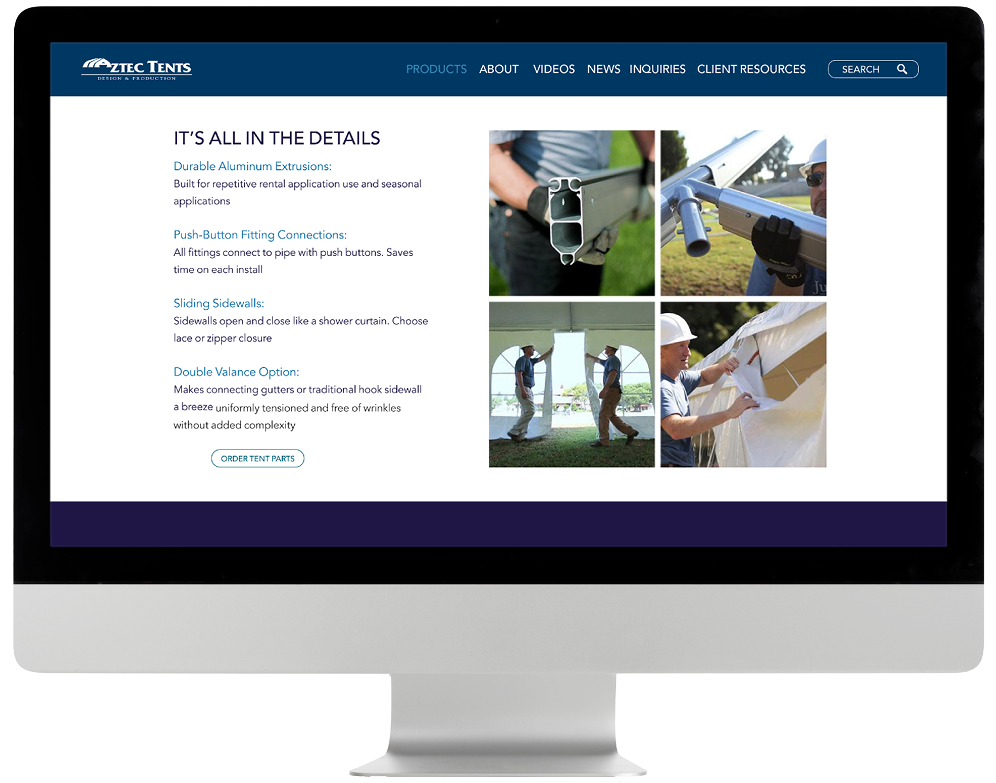
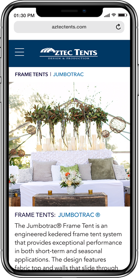
and much more. Their website had not been updated since 2005 and needed a complete overhaul. The webiste needed to be
responsive, but it also needed to showcase all of their products, instructional videos, photography, tent diagrams, and
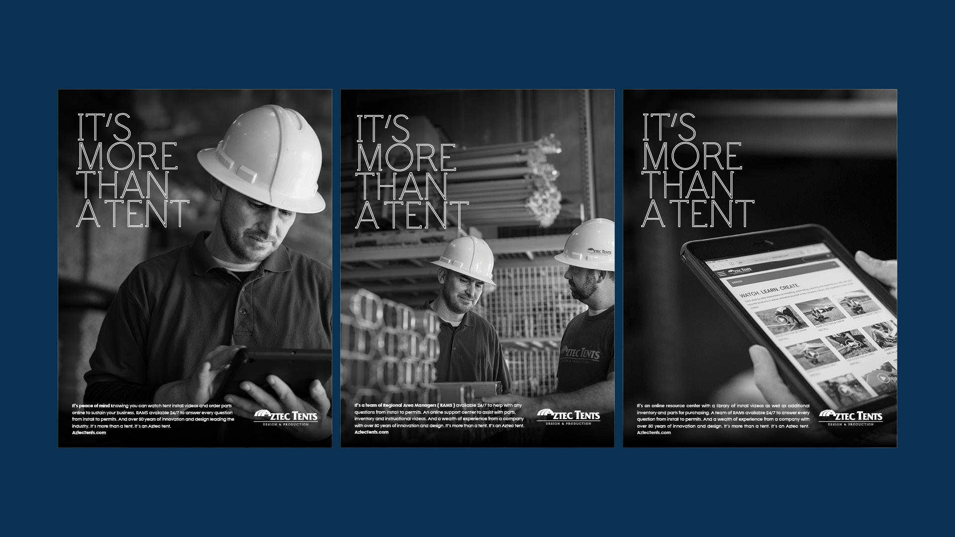
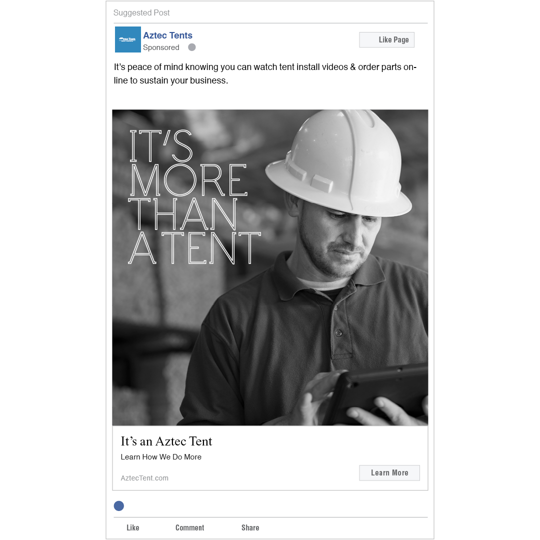
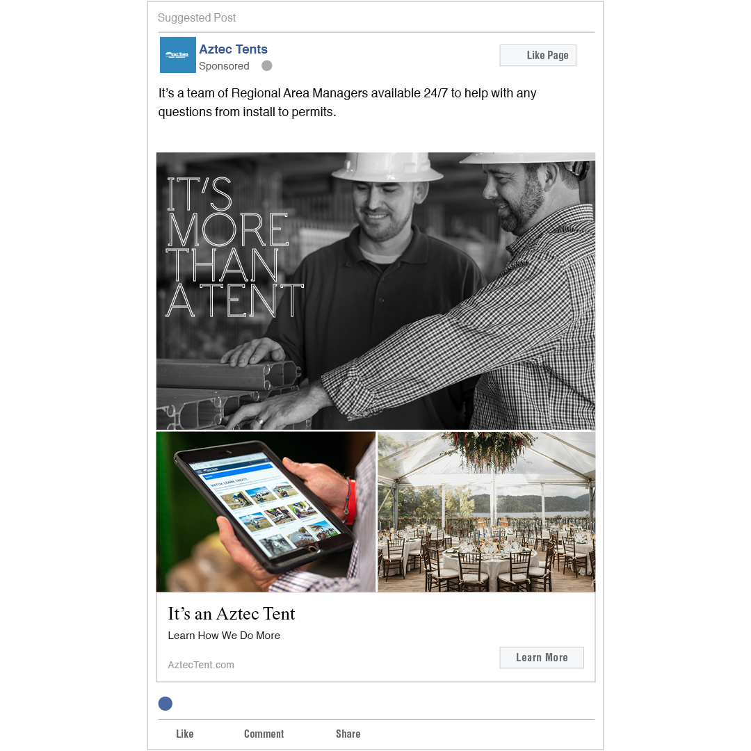
much more. With the launch of the new website, they also wanted a corporate campaign with messaging tied back to the
manufactoring and customer service aspect of their work.
Visit Aztec Tents >
Role:
Lead Designer
Deliverables:
Website Re-design, Video & Photography Direction, Digital Campaign, Print, Copy
Industry:
Tent Manufactoring